Brand Guide

Learn how to apply DPW's new logo, primary and expanded color palette, and typography to create materials that are clear, cohesive, and on-brand.
Below are details on specific parts of the Brand Guide. The full Brand Guide can be downloaded here.
- Logo Usage
- Typography
- Accessibility and ADA Considerations
- Color Palette
Logo Usage
The Department of Public Works (DPW) “City wordmark” logo is used on all public-facing materials. The use of the official logo ensures residents can recognize official collateral.
To maintain consistent use and ensure the integrity of the logo, use only approved art files and follow spacing, minimum size, and proper use guides.
Spacing & Minimum Size
Clear space is the area surrounding the logo that must always be free of text or any graphic elements. This ensures that the logo stands out in any environment and is legible.
Clear space is measured by the height of the M in Milwaukee in the DPW logo, shown as the gray M below. The minimum clear space is the height of one M on all sides of the logo. Whenever possible, the amount of clear space should be greater than the minimum shown here.
![]()
To ensure the integrity and legibility of the logo, never scale the logo smaller than 1 inch in width.
Proper Use
The logo should always be reproduced from the master art file. Never redraw, replace, or modify the logo in any way. Keep the logo in proportion.
Do not:
- Warp, stretch, crunch, or rotate
- Put text or design elements too close
- Place on busy backgrounds or colors that make it hard to read
- Change the colors, change the fonts, or add text or other elements
- Crop the City of Milwaukee portion out of the logo
- Use the DPW “seal” logo
Primary
Use the horizontal variation whenever possible.
| Horizontal | Horizontal Reverse |
| Download PNG Download EPS |
Secondary
Use the stacked logo variation when a vertical orientation is preferred (e.g., as badges on a t-shirt).
 |
|
| Stacked | Stacked Reverse |
| Download PNG Download EPS |
Email Signatures
For consistency in information communicated to internal and external audiences, DPW maintains an official email signature.

Letterhead
DPW maintains an official letterhead format that must be used for all formal correspondence and mailed communications. All divisions and staff are required to follow this standard to ensure consistency, professionalism, and compliance with departmental branding guidelines.
Guidance:
- Use Arial 12 pt font for body copy.
- Do not add additional names to the letterhead.
- Get permission from the signatory of the letter before sending.

PowerPoint
For consistency in presentations to internal and external audiences, DPW utilizes the City of Milwaukee PowerPoint template.

Typography
Primary Typeface: Myriad Pro
Myriad Pro is the preferred font for accessible external communications and should be used as the typeface in any public-facing materials. Different weights of Myriad Pro can be used as needed. Myriad Pro is an Adobe font available for download here.
Note: Official DPW template files have established paragraph styles.
Preferred for Headlines: Myriad Pro Bold
Preferred for Body Text: Myriad Pro Regular
Preferred for Captions: Myriad Pro Light Italic
Secondary Typeface: Arial
Arial is the recommended typeface when Myriad Pro is not available.
Preferred for Headlines: Arial Bold
Preferred for Body Text: Arial Regular
Accessibility and ADA Considerations
Event Accommodation Statement
Any event communication going out to the public (e.g., meeting agendas, newsletters, publications, public meeting/hearing flyers, and electronic versions of these materials as applicable) must include the statement below:
Reasonable accommodations provided for persons with disabilities upon request. Call (414) 286-3475 or email [email protected].
If the event communication references a specific venue location (e.g., postcard invitation, event posting descriptions, newsletters), include the location statement:
[Location] is an accessible facility. Reasonable accommodations, of an auxiliary aid or service required due to a disability, for a City of Milwaukee event will be provided upon request. Contact the City of Milwaukee ADA Coordinator, 414-286-3475 or [email protected], as soon as possible but no later than 72 hours before the scheduled event.
Alternative Format of Printed Materials
Print materials (e.g., agendas, brochures, meeting notices, reports) must contain the statement below:
This material is available in alternative formats for individuals with disabilities upon request. Please contact (414) 286-3475, [email protected], or TTY: 711.
Include “Braille” and “Large Print” symbols if space allows:
![]()
![]()
Translation Requests
If your project requires translation/translators, please email requests to the City Clerk’s Office (Jim Owczarski at [email protected] or Dana Zalazny at [email protected]) for local translation services.
Consultants should coordinate use of City translation services with the City employee managing the project.
Translation requests must include a plain text Word document of the text content you would like to be translated. It is recommended to include a PDF file of the English version of the fully designed final material(s) as a reference. Please allow a minimum of one week for Spanish or Hmong translation of a social media graphic, brochure, or flyer. Longer time periods may be required for reports and other larger documents. Please plan accordingly.
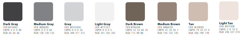
Color Palette
Primary Palette
The primary DPW color palette should be the first choice when producing DPW-related materials. There is an expanded color palette available for use in map making, adding color variety, and enhancing the contrast and accessibility of materials.
Always check the contrast of background colors and font colors to maintain accessibility. See the Color Contrast page of the Brand Guide for text and background color combinations.

Examples of Acceptable Use:
- Background shape behind primary text
- Background color of digital or print material
- Text color of accent text; use Black or White for primary text
Secondary Palette

Examples of Acceptable Use:
- Background shape behind secondary text
- Accent color on digital or print material
- Color of accent iconography or shape
Expanded Palette
The expanded DPW color palette supports the five-color primary DPW color palette. It is available for use after the primary DPW color palette has already been applied. Expanded colors are recommended for making maps, to enhance accessibility, and to add color variety. Additional colors not shown here should not be used for backgrounds and should not overwhelm the official DPW colors.
When making complex maps, consider including using different styles like dashes, dots, and patterns to create distinctive symbology. Learn more tips in the Map Making Guide.

Neutrals